In recent years, the term “Responsive Design” is often used when describing websites, but still, a lot of people don’t really know what this term means or if their website is responsive, so we wanted to delve a bit further into this and give you a bit more of an insight into the meaning of responsive design.
A website which is responsive will adjust automatically to the screen size you are looking at the site on and allow you to read/view it comfortably. If you view a website on your phone or tablet which requires you to scroll horizontally across your screen as you’re viewing it, or the content is so small that the whole website fits on your screen and prevents you from reading it without zooming in, the website isn’t responsive.
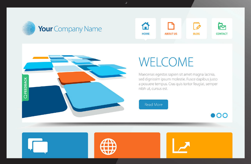
To explain responsiveness, here is an example of a website:
Now, we look at this same website on a smaller device and how it would load if it was responsive vs not responsive:
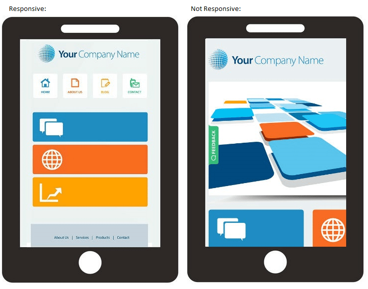
If this site was responsive, it would appear similar to the example on the left and if the site wasn’t responsive, it would appear like the example on the right.
There are usually two scenarios as to how websites would display if not responsive.
- Zoomed In: If the website loads like it is zoomed in like the one on the right above, the viewer will be scrolling across forever to see all elements.
- Zoomed Out: If the website is zoomed out when it loads, the site content would not be readable and the elements would be difficult not to click as you zoom in. The user will need to zoom in to read all the content on the website.
There are many reasons as to why your website should be responsive. Here, we look into why.
According to an interesting article that The Guardian released, it was confirmed that in November last year mobile devices are now used more than computers when it comes to browsing the web. The article suggested that mobile and tablet browsing was accounting for 51.3% of browsing, compared to 48.7% of traffic coming from desktops. We suspect that in the last 6 months that this figure has increased well above 51.3%, with the release of new phones and tablets on the rise every week.
If you don’t have a responsive design and these statistics aren’t enough to make you want to look into a responsive design, then maybe after hearing that Google Search is now choosing to display mobile-friendly websites above other websites when a user is searching on their mobile through Google is enough to shock you into updating your site?
What this means is that if a user is searching for your type of business on their mobile, your website won’t show, unless it’s optimised with a responsive design. This was confirmed by Google in 2015 and is stated here. The whole idea behind Google making this decision was that they wanted to make it easier for users to find high quality results optimised for their devices.
With Google choosing to display responsive websites on mobile searches, it could be costing your company in sales if you don’t have a responsive design, as many people may not even find your website through a Google search on their mobile. Your competitors may even be taking valuable revenue from you, without you even realising or knowing.
Along with these statistics and validation that Google has put into place, there are some other reasons why you should look into a responsive design. These include, but aren’t limited to the following:
- Social Media: With most people checking Facebook or Twitter on their tablets or smartphones, if your website isn’t responsive it could be detrimental to your business. The reason is that if someone finds your business through Facebook and visits your website through their phone from Facebook, they could get tired of scrolling or not being able to read your content easily.
- Online Shopping: Along with standard mobile use, the online shopping figure has also increased for those who use their phones to do this. Those who use their phone to purchase online like easy navigation and if your customers can’t navigate through your products easily, they too, could just close your website and give up on their purchase (especially with the number of steps needed to proceed with a purchase).
So, why don’t you take a moment to make sure your site is responsive?
In the article linked above from Google, they released a handy mobile-friendly test tool, available here, which will tell you whether your site is responsive.


